Thursday 24 March 2011

EVALUATION OF PROMO CAMPAIGN

One of the most critical questions to ask ourselves, as a production team is whether or not it appeals to the targeted audience. Firstly, I feel the song choice was appropriate for 16-25 year olds as our research and audience feedback shows that rap music is one of the most popular music genres for this age group. But, because our song does not have all the characteristics of 21st rap; this status may not apply to the Beastie Boys tracks. The style of the pop promo I feel is also very true to what we wanted to promote the band as. I think the style of the pop promo is matched with the design and layout of the poster and digi pak which will give the band more of an overall image than if it were done in a differently styled way. Furthermore, because of these similarities the audience that would be attracted to the pop promo will also be attracted to look at the bands poster, making the band very specifically targeted.

If my pop promo were actually aimed to go into the music industry there would be different expectations. The music business is growing into a multibillion pound industry, thus making competition to become a well known, signed band is getting fiercer. Perhaps instead of us finding a song and getting people form our college to perform in a matter on months would be unreasonable in real life terms. The overall process would take longer as the band may have to go through stages to getting signed and the procedure of making the video will be longer as promotional tours, interviews and radio meetings would have to be organised. Equally, because our band Cobalt Rapture is somewhat similar in style and music kind to the Beastie Boys, Good Charlotte and Bink 182 there may be a lesser chance of them being signed by a major label.

Intergalactic conforms and subverts certain codes and conventions of existing pop promos. The conventions set about in terms of music video by Blink 182 are somewhat mirrored in our music video. I feel cobalt Rapture conforms to the boy band groups who are coming from a lower classed background who poke fun at other peoples lives whilst trying to have a good time. It conforms mostly by shot choice. We chose to include shots of the band messing around and doing things like playing tug of war to give to show their youthful image. But, there are codes the band have subverted for example appearance and music video. In today’s rap charts the majority of the artists are African males, having minimally dressed girls in their videos. In this was our video does not conform as neither of these are evident in the pop promo. We chose to use white males as there may be more of a gap in the market for this type of group. The girls were not featured in the music video as we wanted the promo to focus on the boys themselves going about their seemingly normal day. Although we market the band as organic, there are some synthetic factors to them. We did this so the band could be easily marketable, e.g. could do an advertisement for Coke. To ensure this image was successfully advertised to the public we had to make certain the perfect mix of characters was applied.

The campaign itself is very specific to the pop promo. Not only because we used still from the studio to make it but there is a very clear theme running throughout. This theme is sci-fi with a modern twist, shown by the costumes, set and alien included in the shots. But, possibly the images used for the digi pak should be more varied because if you hadn’t seen the pop promo you may think the style of music was not classic rap. In a way, it think perhaps even one of the inlays should have been the band in their normal attire to show what they are usually like as the video is all about being yourself.


The track itself, being rap music does not match the 21st centaury rap star image. However, it does meet the 90s rap star criteria and so there is some evidence to say the image and track match in a package like convention. To ensure everyone knows about the band there would have to be a heavily manufactured marketing campaign by the record label. The band would be fundamentally used to draw in a musical audience so the label may attempt to make the band more seem more ghetto and conform to the rapper stereotype.
At the beginning of this exercise we were given a brief to create a pop promo. Cobalt Rapture as campaign fully meets the brief as there are many marketable aspects of the band, whether they would be performing of endorsing other products. The successful developed image of the pop promo, poster and digi pak make the band as a whole appeal to the target audience of 15-25 years olds. By using the correct forms and conventions of the rap songs around today but also making the video original to the group I feel confident that we will reach our targeted audience.


I feel the group may be signed to a lable like Def Jam records and this is a picture of one of the co-founders, Russell Simmons:


Tuesday 22 March 2011

FINAL POSTER


This is our final promotional band poster for Cobalt Raptures album “Hybrid Dream”. We feel happy with it as it as it clearly shows the tour dates for the band whilst keeping in tune with the sci-fi theme.
The use of the Alien to show the bands may encourage brand recognition and shows we have used synergy in the marketing campaign of the group.
Though, one fault perhaps is that if you had not already seen the music video, you may be unaware of the band as it does not show their faces. Equally, from an advertisement point of view you may think that the lead singer is dressed up as an alien, which could be a fault.
We used the same writing font for the poster and digi pak to also promote brand recognition, forming a visual link for the audience from seeing their CD to looking at their poster and going to their shows.

Final digi pak

Inlay 1 :


Inlay 2 :


Back cover:


Front cover:


From our pop promo to the poster and digi pak there are very evident synergistic links. The products are linked in the form of writing font, theme and style. The products should be linked so that the audience can relate from one product to another is a subtle way.
The digi pak and pop promo relates to each other plenty. All of the shots used for the digi pak were taken on the shooting day and so the costumes, make up and set are the same.

Monday 21 March 2011

TASK FOUR: HOW DID YOU USE NEW MEDIA TECHNOLOGIES IN THE CONSTRUCTION AND RESEARCH, PLANNING AND EVALUATION STAGES?

Alex:In order to discuss with a visual aid which digital technologies were used in the making of Intergalactic, Alex and I constructed a commentary script:


Steph: For the pre production stage of the pop promo, we continuously used the internet, especially Youtube to research other bands and songs that are similar to our chosen one. The Youtube site enables us to watch, listen and comment of a huge variety of songs which was really helpful. We also used the search engine; Google to research star images and music genre to improve the development of our own ideas of the pop-promo.

Alex: Another example of new media technologies used in the planning of the music video is using a Sony PD170 to film the storyboards. Once filmed we used final cut pro to produce an animatic. During the shoot day we used a Sony NX5s and shot the whole video in high definition giving which gave the video better quality and thus a more professional feel. When in the studio filming the video, a 42 inch Samsung monitor was used whilst the song was being played through a CD player. Steph and I used a blue screen in our pop video as we wanted to put in backgrounds like magazine covers and Simon Cowell to show the aliens rise to fame clearly.

Steph: After filming the music video, the rough cut was transferred onto a Mac G5 where we used final cut pro to edit the music video. The software used for after effects was called After FX, this was used to change the background from the blue screen to the images evident in the music video.

Alex: For the exhibition and distribution of our music video we uploaded it onto Youtube, facebook and Blogger. All of which method are via the internet and so they are new media technologies. Youtube allowed us to reach a mass audience of all ages, cultures and genders which was beneficial as feedback was very broad. On the other hand, facebook only promoted the promo to our friends and therefore to a more confined age group.

Steph: In conclusion, new media technology played a very consistent role in all areas of producing our media product, ultimately making the whole process more efficient and time effective. The most interesting new media technology we used was the after effects, especially as both Alex and I had never used the programme before.

What have I learnt from audience feedback?


Alex and I used various new media technologies to receive audience feed back from our music video. Firstly, the promo was uploaded onto YouTube so audiences all over the world could easily access our product and write comments on the same page. Example of feedback Intergalactic received is, “Well performed - narrative slightly unclear. Great setting and after effects :) GOOD JOB. !” The downside, however to using this application was that because you had to enter the specific hurtwoodhousemedia and then find out music video, many users of YouTube may not have come across it. Another way of released our product to an audience was posting it on our online blogs on the Blogger site. But, also like Youtube, Blogger had certain limitations like no everyone can view it easily; you would have to have a log in to view the video. In search of a better, more efficient way of reaching my target audience of 15-21 year olds I posted the Youtube link onto my own facebook profile where I received a wider range of feedback from many different people. Most being positive and an example of this is “Great after effects, good job!” The last area of audience feedback we examined was the standard questionnaire after getting twenty people to watch the music video. We designed the questionnaire to ask detailed questions of their likes and dislikes and what we could have done to make our video appeal more personally to them. I found this area of research to be more useful as we gained a greater understanding of what we could have improved on and whether our video appealed as well as we thought it would to our target audience. However, some of the questioned people did not give us a detailed enough understanding and their answers were relatively broad as there were time constraints. So, overall I think the questionnaire gave the best results but using Youtube allowed more people to watch the media product.

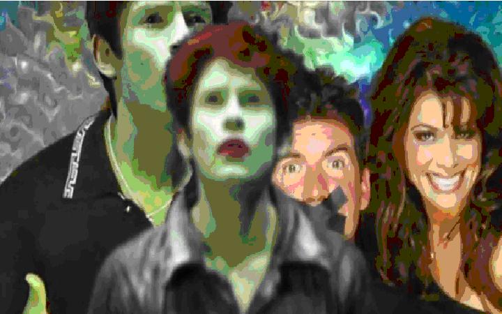
An overall 70% of our focus group answering the questionnaire said they enjoyed the song choice and thought that the video had a good balance between narrative and performance. Only 45% of the focus group already had heard of the Beastie Boys and knew the song Intergalactic, which was beneficial in a way for us as producers as the majority of the audience had to point of reference so thy could not compare ours to the already existing video. All of the audience ticked the enjoyed box on our questionnaire and so I feel the promo was successful to an extent as it entertained our audience, which was our main objective. After conversing with one of the interviewees after the questionnaire was completed, they stated that they felt the editing really fit in with the song choice and quirky set and they felt that kept a upbeat and jolly vibe throughout the video. I think that the close ups of the band members pulling comical faces and engaging in activities not usually carried out on a space ship makes the video fun to watch. A few audience members vaguely mentioned in the other comments section that the scene where the space ship crashes and the rappers are being tossed from side to side could have been filmed better as it was not framed up very well, which I also feel could have been improved on. Alternatively, others commented that it made the promo more visually stimulating and helped them understand what the rappers were actually doing on the ship. The band’s image does not fit into the classical rapper stereotype, as there is only a few other white rapper groups I feel this gives Cobalt Rapture a unique selling point and thus inspire more people to listen to their music.


There were equally apparent weaknesses to our music video that were brought to our attention through the questionnaire and Youtube comments. The main criticisms were a slightly unclear narrative. The audience felt that the story was not built up enough and did not understand the aliens rise ad fall to fame and even why this was included in out music video. Comments on YouTube and from the focus group reflected this particular weakness. Furthermore, there were also comments in our questionnaire saying that the set and lightly were very well done and pulled the whole video together in terms of professionalism and genre. The encoding-decoding model derives from the work of Stuart Hall. It is a theoretical model, which is based upon the notion that the audience do not act as a ‘mass’, but rather as a collection of smaller groups defined by social and ideological elements. Media texts are ‘encoded’ (both consciously and unconsciously) with the values of their producers, who are generally white, middle-class, men. However, the audience is not made up exclusively of these groups and different groups are likely to ‘read’ the text indifferent ways. This ‘decoding’ process has 3 possible outcomes which are a preferred reading, a negotiated reading and an oppositional reading.

A preferred reading is referred to when the audience understand the intended values and the concept behind a given media text. The preferred reading of my music video was a group of lowly skilled workers rapping as a part of having fun, the alien narratives preferred reading is mostly to poke fun at the ease of 21st centaury fame but also to show how quickly the rise and fall happens to most people. This questionnaire proved that majority of the audience was able to understand and accept our preferred reading.
Negotiated readings are when people understand some values and they accept a selected few elements of a media text whilst developing their own opinions. We received a negotiated reading that the rappers were not actually in control of the ship but hijacked it instead and decided to dress as space men. An alternative negotiated reading about the alien was that he was a lonely pop star, supported by the walking down dark roads scenes and we used the video to convey similarities between humans and other life forms.
To conclude what we learnt from audience feedback is that out largest criticism if narrative being slightly unclear at times, especially at the start. We could have improved on this by building up and giving more examples of the alien being not famous. One the other hand, a large extent our narrative was successfully translated to the audience due to the shots, lighting and narrative strands.

Mock up of front cover of the album


I did this picture quickly on paint. I would use photoshop to do the real thing and change various things like contrast, shape of the window and add in the bands name and album name. This was just to show you what we were thinking of doing, having the space craft landing with the boys looking out the window. I also think that we might make the background (landing strip) more cartoony and fictional to carry on the sci fi theme. Within the digipack we can also carry on the space vibe and compliment it with special writting and images.

Sunday 20 March 2011

ANCILLARY PRODUCT DEVELOPMENT 2 – POSTER

The process of deciding what we wanted our poster to look like was a multi stage process. We started by thinking about what we wanted this to show for the band. Firstly we though a shot of the space craft with the three rappers looking out of the window in despair would work. However; after some discussion we though the colour scheme of the dark grey space ship and the writing would not work so we scrapped that.

After looking at the pictures from the shoot day we then thought having the picture of the aliens face would be a worker. But, after putting the photo on Photoshop to edit it, the colour scheme again did not work and the writing made the aliens face look very unclear. This was a real problem as we felt the colour scheme should definitely be blue but we needed to also find a suitable picture for the poster. So we continued to look for a picture we could use that would not have a huge colour clash with the writing colour.

We came across a picture in the spacecraft with standing to the side. This picture would be great to use as the background colour was silver but it had the alien in it, which is a recognisable band image. As the alien is standing to the left of the frame we could use the other empty space to write the bands tour dates and their locations. We really thought this was the best way to promote the band as it incorporated aspects from the video so it makes them recognisable which was needed to make the pop promo actually promotional.

Although we had decided which colour font to use we had to actually find the font we could use for the poster. We started with the jokerman font but found it was unclear and not very easily read. After experimenting and doing some research on the internet, we found a fitting font and decided to write the whole text in it.


The picture is landscape and so this helped us form a basis of the layout. We chose to have the alien on the far left and tour dates written down the right hand side.
This stage took a very long time but now we are happy with the final product and it turned out to promote the band the way we wanted it to. The audience feedback showed that the digi pak and poster complimented the video and the sci-fi theme was carried through successfully.

Saturday 19 March 2011

on-going development of the digi-pak

The digi pak should include pictures of the band, a track list, bar code, record label signature photo, small print and maybe a personal message from the band.
All of these aspects form an image for the band and to promote their image we use synergy. For this task Alex and I tried to make the digi pak as different as we could to others out at the moment to attract our target audience and also to

make sure as many people as possible would look at the band.
The front cover is used as a device to attract the target audience as this is the first thing most people will see when in a CD shop. We also wanted to make sure the back cover tied in with the theme and so used a picture of the alien in the spacecraft with the other tracks on the album next to him. Thus, making it very important. Depending on the age, gender and style of the target audience different techniques will be used. For example our target audience is 16-25 years olds and so we wanted a fun looking front cover with the space invader symbol shown predominantly. We then carried on the space invader symbol throughout the digi pak and poster to give the band synergy. After looking at the digi pak, the audience will associate the band with that symbol meaning the record label can then go on to sell Cobalt rapture merchandise with that symbol on it, making the band more recognisable. We felt the audience could relate to this symbol as it is a popular video game and it shows the playful vibe of the band but also their 90s style. The inlays include a picture of all of the rapper bending over. We did this as if the front cover was them leaning toward the camera and the first inlay looks as if there is a camera behind them. This relates to their image of low socioeconomic group as the first photo apart from the album cover looks as if it was an accident. Also relating to the part in the video when everything goes wrong for the rappers and the space ship nearly crashes, causing a visual link to the pop promo. The location of all of our digi pak pictures is the space craft, mostly because we had not made up a set anywhere else, but also because we felt the spacecraft was an iconic look for them as not many other bands had done this recently.

For our digi pak we used a continuous writing style throughout, and also used that font in the poster. We did this for synergy as when the audience see the writing they will relate it to the band. It took quite a while to find an appropriate font that worked with the bands image and pictures. In the end we used a graphiti looking font and put four letters over each other to make it look as though it was moving. The main colour we selected was blue because the bands name is Cobalt Rapture and most people think the element cobalt is blue.

By using the same font and colour scheme in both the digi pak and poster, I feel the image of the band was promoted successfully through synergy. The style of both the poster and digi pak compliment each other and promote the band image of young men wanting to have a good time but not being perfect was achieved successfully.

These are some example of the writing we were thing about using.

Sunday 13 February 2011

ANCILLARY PRODUCT DEVELOPMENT 1 - Digi pak


Alex and I got together to talk about the sways we could incorporporate synergy. Synergy is referred to as, the interaction of two or more agents or forces so that their combined effect is greater than the sum of their individual effects.
The digi pak has 4-6 frames, usually with a common theme running through the background, writing and style. I have included a picture to show how the folding of paper gives shape of the digi Pak.

Our initial idea for our digi-pak was to have the boys poking their head through the space ship as the front cover, the alien on set for the back cover and pictures of the band on the two inlays. Luckily, on the day of shooting we took many photographs so we had a lot of choice. Because of the video, we wanted to incorporate a sci-fi feel to the digi pak to help for promotions; we did this by using a special font of writing and colours. The symbol we chose for the band is a space invader, which we incorporated into the back cover as a bar code. We felt this could be used as a kind of synergy as when people now see the image they will cast their mind back to Cobalt Rapture. This is the space invader image we used:


The back cover the alien standing within the space craft set smiling. We wanted the alien to be the last thing the audience see so they will remember the music video ad possibly he was the most memorable part of the music video. This further links the digi-pak to the science fiction theme evident in the music video. By using the image the audience will also realise that the band is not regular pop as images of the band are not displayed throughout the digi pak.. The back cover also shows a track list, barcode, record label and small print.
The intended front cover was supposed to be the rappers staring frantically out of the space craft that looks as if it’s rapidly declining down to Earth. However we felt that the front cover instead should be a photo of the rappers with the space invader game over it, to create even more synergy. Some example of the Bestie Boys digi pak covers are:

Friday 11 February 2011

Still shots from our music video


This image shows some of the affect effects used in our music video. Firstly, we got Ted (the alien) to pretend he was running whilst sitting on a chair to ensure the camera framing was correct. After a few practices the blue screen was taken out and put behind him. Once filmed, we went into using abode after effects in the editing sweet where we found these images and set it as an ongoing background to give the effect as if he were running a long the street. The lighting is dark to reflect his mood of feeling alone and vulnerable in a new city.
I think the cgi worked really well in these scenes as the cartoon like background shows he is a sort of make believe world that seems scary to him.


This image represents how the rappers had made a mistake and our now suffering from turbulence and space craft instability but they are still rapping. The reason for this is not only because it is a music video but it shows that they do not enjoy and are not particularly good at their day jobs but they are truly devoted to their music. From this screen grab one can also deduce a strong sense of band image. The image of the band that we, as a group tried to create was that they are a group of fun, unique and devoted individuals that are not completely conforming to the rapper stereotype, and like to poke fn at the current state of the music industry. This perhaps challenges the conventions of most rap music videos as it is rare to see a group of white rappers getting things wrong and engaging in such a broad range of activities. However, now that synergy is used frequently in music videos today to advertise their outfits and accessories to the audience. An example of this could be fans of Cobalt Rapture going out and buying boiler suites and chains to be more like the band. Another way that our music video does not conform the usual rapper video is that we do not have any females. More and more usually there are half naked girls in rap video to make you feel you want to be more like the rappers as they can get any girls they want. We did not incorporate this into our music video as we felt that the audience should be attracted to the bands sound and personality, and using good looking girls would take away from this. Other music videos of the white rapping genre are similar to our music video. They show the band poking fun at other people and in some cases their own lives; these bands are Blink 182 and Good Charlotte. This is another convention of music videos, as bands are often dressed in a certain way to target their audience and to conform to their genre.
This screen grab is another example of the affect effects used for the pop promo. We used Simon Cowell in the video to illustrate the aliens rise to fame as many people knower days gain stardom from reality TV shows like x factor and American idol. To do this we took an image from the web and photoshoped Ted into the frame.


I chose this picture to show how the costumes and personalities make the rappers conform to a working class, low skilled worker. Traditionally, the blue collar represents low income groups that are on the JICNAR scale as C/D groups. The video was sued to convey that they too have ambitions.


There is a space invader symbol present on every panel of the albums digipak, and is also evident in the bands poster. It was conventional to add this symbol into both promotional packs to give the band synergy. We hope that because the well known symbol had not yet been associated with any bands, it will give the audience as sense of recognition when looking at it. An example of this is the TT symbol Take That have used on all of the band documents.

Thursday 10 February 2011

Tuesday 1 February 2011