Sunday, 13 February 2011

ANCILLARY PRODUCT DEVELOPMENT 1 - Digi pak


Alex and I got together to talk about the sways we could incorporporate synergy. Synergy is referred to as, the interaction of two or more agents or forces so that their combined effect is greater than the sum of their individual effects.
The digi pak has 4-6 frames, usually with a common theme running through the background, writing and style. I have included a picture to show how the folding of paper gives shape of the digi Pak.

Our initial idea for our digi-pak was to have the boys poking their head through the space ship as the front cover, the alien on set for the back cover and pictures of the band on the two inlays. Luckily, on the day of shooting we took many photographs so we had a lot of choice. Because of the video, we wanted to incorporate a sci-fi feel to the digi pak to help for promotions; we did this by using a special font of writing and colours. The symbol we chose for the band is a space invader, which we incorporated into the back cover as a bar code. We felt this could be used as a kind of synergy as when people now see the image they will cast their mind back to Cobalt Rapture. This is the space invader image we used:


The back cover the alien standing within the space craft set smiling. We wanted the alien to be the last thing the audience see so they will remember the music video ad possibly he was the most memorable part of the music video. This further links the digi-pak to the science fiction theme evident in the music video. By using the image the audience will also realise that the band is not regular pop as images of the band are not displayed throughout the digi pak.. The back cover also shows a track list, barcode, record label and small print.
The intended front cover was supposed to be the rappers staring frantically out of the space craft that looks as if it’s rapidly declining down to Earth. However we felt that the front cover instead should be a photo of the rappers with the space invader game over it, to create even more synergy. Some example of the Bestie Boys digi pak covers are:

Friday, 11 February 2011

Still shots from our music video


This image shows some of the affect effects used in our music video. Firstly, we got Ted (the alien) to pretend he was running whilst sitting on a chair to ensure the camera framing was correct. After a few practices the blue screen was taken out and put behind him. Once filmed, we went into using abode after effects in the editing sweet where we found these images and set it as an ongoing background to give the effect as if he were running a long the street. The lighting is dark to reflect his mood of feeling alone and vulnerable in a new city.
I think the cgi worked really well in these scenes as the cartoon like background shows he is a sort of make believe world that seems scary to him.


This image represents how the rappers had made a mistake and our now suffering from turbulence and space craft instability but they are still rapping. The reason for this is not only because it is a music video but it shows that they do not enjoy and are not particularly good at their day jobs but they are truly devoted to their music. From this screen grab one can also deduce a strong sense of band image. The image of the band that we, as a group tried to create was that they are a group of fun, unique and devoted individuals that are not completely conforming to the rapper stereotype, and like to poke fn at the current state of the music industry. This perhaps challenges the conventions of most rap music videos as it is rare to see a group of white rappers getting things wrong and engaging in such a broad range of activities. However, now that synergy is used frequently in music videos today to advertise their outfits and accessories to the audience. An example of this could be fans of Cobalt Rapture going out and buying boiler suites and chains to be more like the band. Another way that our music video does not conform the usual rapper video is that we do not have any females. More and more usually there are half naked girls in rap video to make you feel you want to be more like the rappers as they can get any girls they want. We did not incorporate this into our music video as we felt that the audience should be attracted to the bands sound and personality, and using good looking girls would take away from this. Other music videos of the white rapping genre are similar to our music video. They show the band poking fun at other people and in some cases their own lives; these bands are Blink 182 and Good Charlotte. This is another convention of music videos, as bands are often dressed in a certain way to target their audience and to conform to their genre.
This screen grab is another example of the affect effects used for the pop promo. We used Simon Cowell in the video to illustrate the aliens rise to fame as many people knower days gain stardom from reality TV shows like x factor and American idol. To do this we took an image from the web and photoshoped Ted into the frame.


I chose this picture to show how the costumes and personalities make the rappers conform to a working class, low skilled worker. Traditionally, the blue collar represents low income groups that are on the JICNAR scale as C/D groups. The video was sued to convey that they too have ambitions.


There is a space invader symbol present on every panel of the albums digipak, and is also evident in the bands poster. It was conventional to add this symbol into both promotional packs to give the band synergy. We hope that because the well known symbol had not yet been associated with any bands, it will give the audience as sense of recognition when looking at it. An example of this is the TT symbol Take That have used on all of the band documents.

Thursday, 10 February 2011

Tuesday, 1 February 2011

Thursday, 23 December 2010

TASK 2- PRODUCTION DEVELOPMENT AND PLANNING


In this task our group must come up with a promotional poster for our up and coming band. To start this project we needed to research into popular layouts and conventions of bands posters. To do this we used the internet, especially Google as the search engine has an images section which is perfect for what we need to further our ideas of what a music video should look like. We primarily looked at the Beastie Boys music posters to see how they have really given off a vibe that suites their style of music. Next we looked at popular bands that are around now to see how the music poster layout has progressed and developed. Through doing this research we learnt techniques that help us understand what it is that makes a great poster stand and be more attractive to the human eye.

I will now take an example of a very different music poster to ours to highlight the differences in campaigns. I found a poster for the singer Justin Bieber used to advertise his new single “never say never”. From the poster we can see only a side image of him, not showing all of his face. On the other hand our band probably would be unable to have a side shot of them as their image has not yet been released so people would find it more difficult to recognise them and this could even potentially decrease sales. The writing is in block capitals spread diagonally across the portrait showing hat this is the most important part of the campaign. The word “NEVER” is highlighted in purple, perhaps proving the colour choice is to draw in girls and draw their attention to the poster. This is backed up by the fact that Justin Bieber target audience is mainly girls from the ages of 10-16. In a smaller yet still fully visible text it tells the audience they can come and watch the show some time in February, potentially the uncertainty of the actual viewing date means that this poster was created way in advance to the actually shows, trying to create a buzz. Also, the simplistic layout and easily readable text could also be a method to attract people, it is a known theory that a page with lots of writing will deter people from attempting to read at it so perhaps this theory was applied to this poster.

After deconstructing other popular pop stars music posters we now have to assemble one on our own. As we took many pictures on the shooting day of the characters we will incorporate the most fitting shot into the poster and then write the bands name and their song name and perhaps even the first gig or release date. This is a very important part of advertising our band and we must make sure that the colour scheme, photo choice and style of writing will draw in the attention of our target audience. When first starting to talk to Alex about this we thought of many different colour schemes and pictures to use. We really wanted to create the idea of a fun loving, young and unique group and hopefully in doing this our target audience of 16-23 years old will enjoy and be able to identify with the band. Finally we decided which picture to use and tried out many different styles of writing. To do this we used an application called Photoshop and so we were able to play around with the lighting and writing position using a wide range of tools available on this programme.

Tuesday, 21 December 2010

Editing

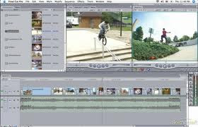
We started editing our music video a few days after the shoot day was finished. We were given a time frame of 2 and a half week to have finished the whole music video, which Alex and I found very difficult, especially as our video had lots of special effects. Firstly, we separated the better takes from the unusable one by creating specific bins for each type of shot. Once this stage was completed we then went on to doing the first narrative; the rappers.


By laying down the track on final cut pro it made it easier so u to get a sense of the timeline and seeing how far into the song we could build up the aliens new found fame. A really difficult part of editing is cutting each shot to the beat of the song and matching up lip movements to the actual song. To find the exact beat you would first listen to a short section of the song where you knew the beat was, then once you think you’ve heard it you pres pace bar and listen to the song beat by beat until you find it. Very luckily our song had a very noticeable and dominant beat so it did not take too long to find it, whereas for others it we very difficult. As for the lip sinking, if you altered the magnification size of the timeline by altering the switch at the bottom left of the screen it gave you a much more precise indication of time. By altering the clip one second forward, especially for parts that needed quick editing e.g. repition of the last word in a verse.

Once this stage was completed we then went on to doing the first narrative; the rappers. Before doing any of the editing we put the track down on final cut pro. We then put the first runthrough of the rap over it cutting it to the beat. Once this is done, the hard part comes when trying to layer other shots of the rappers over the top of it as we were only using smaller parts, maybe only a few seconds long. We only had a few shots of the rappers singing the actual song, so although we were limited in how many shots we could use, it made the process very simple with the selecting shots and inserting them, as we didn't have to go through many shots to find a specific movement or action we liked, as they were already in the shots we had due to good direction on the shoot day. We used shots from all of the runthroughs of the song, as well as the short shots of the rappers repeating the word from the end of each line. After we had got the cut we wanted with the performance, we added the other element of the performance, like the reactions to what was happening to the alien character, and the part where the ship starts to fall apart.


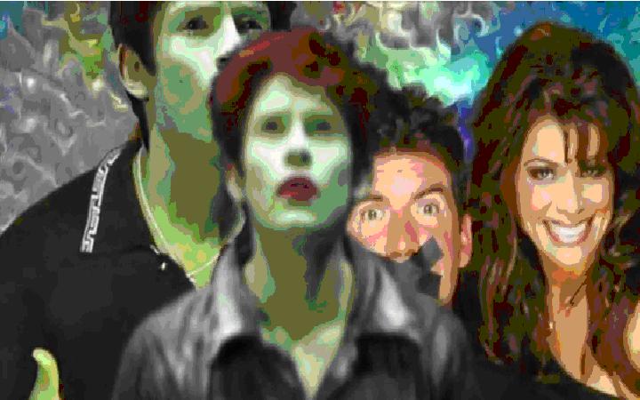
I think we managed this well, and were able to sync the rapping perfectly amidst the chaos of the scene. The final part of the editing process was to put the narrative strand in. This was much easier as the shots were all similar, and all we had to do was to select a shot that could fill in the spaces that we had specifically left for these shots, which matched a certain point in the song. Now all that had to be done was the after effects. For the bulk of after affects Alex and used the Keying technique using abode after effects. This is where you crop out the back ground to replace it with an image that is either made on Photoshop or found on the internet. This is a multistage process and is initiated by resized the image to fit the frame. Once this is resized, you must check the lighting, this is done by clicking effects then keying and finally key light. Then click on the button to the left of the green to select whether a green or blue screen was used. In out media product we used a blue background as the green would have clashed with the green alien. Once the combined matte was allowed, we had to ensure the background was fully black in comparison to the white image we needed to keep to put against the background, e.g. the aliens face. For the beginning sequence of the space ship landing we used a basic key frame animation. This is where we selected specific parts of the screen for the space craft to change direction and the computer fills in in-between frames. The start middle and end point were shown as circular dots on the screen.